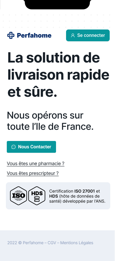
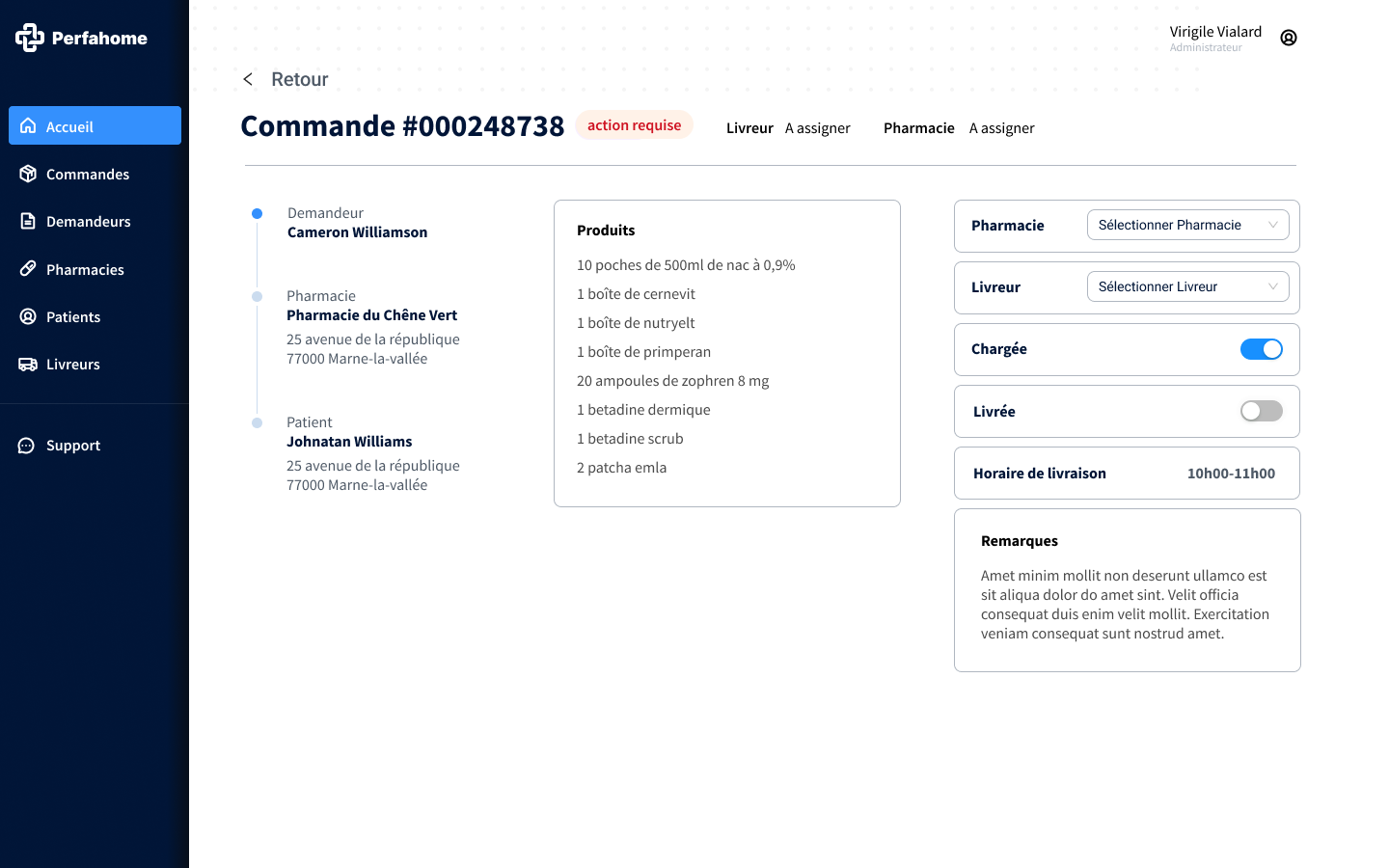
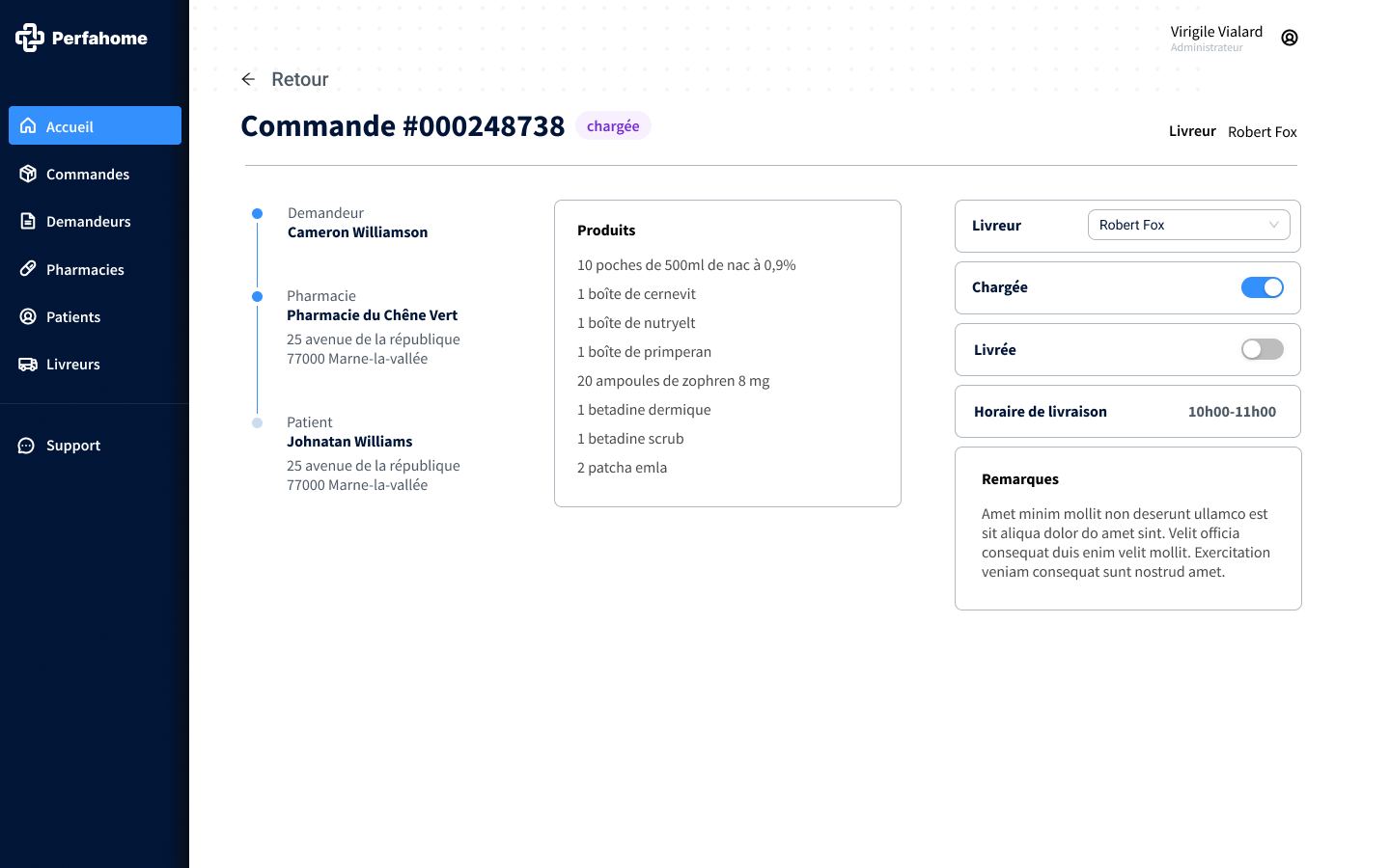
A platform for coordinating home-care logistics across patients, pharmacies, and delivery teams.
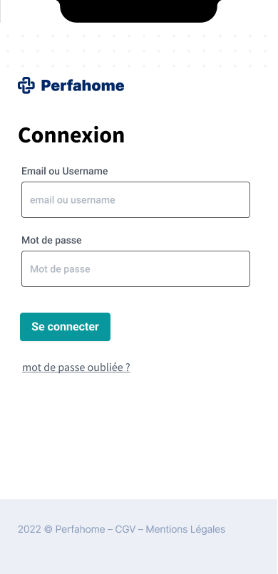
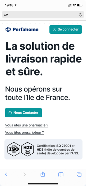
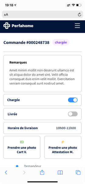
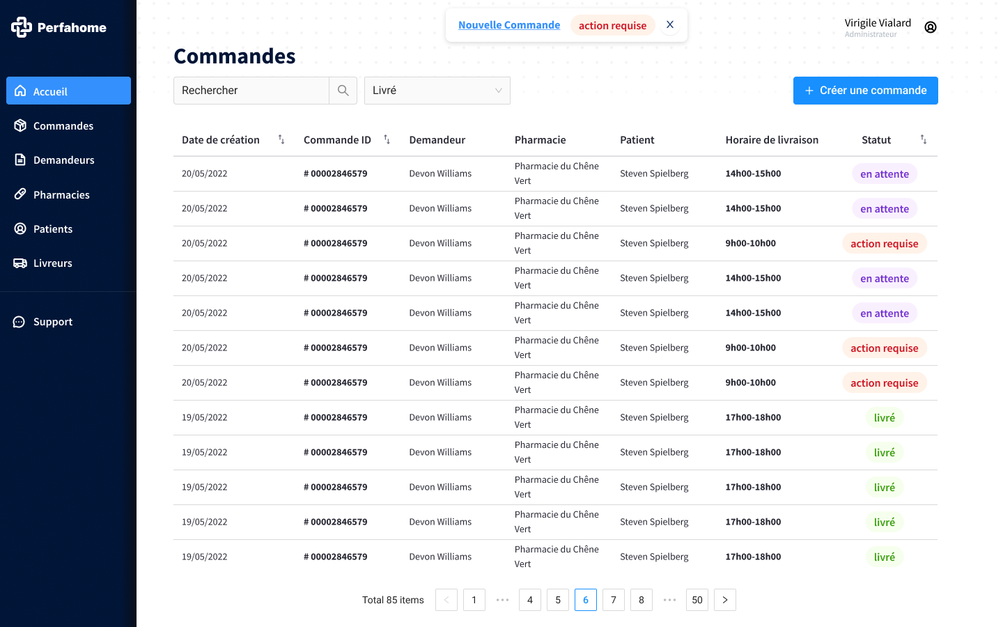
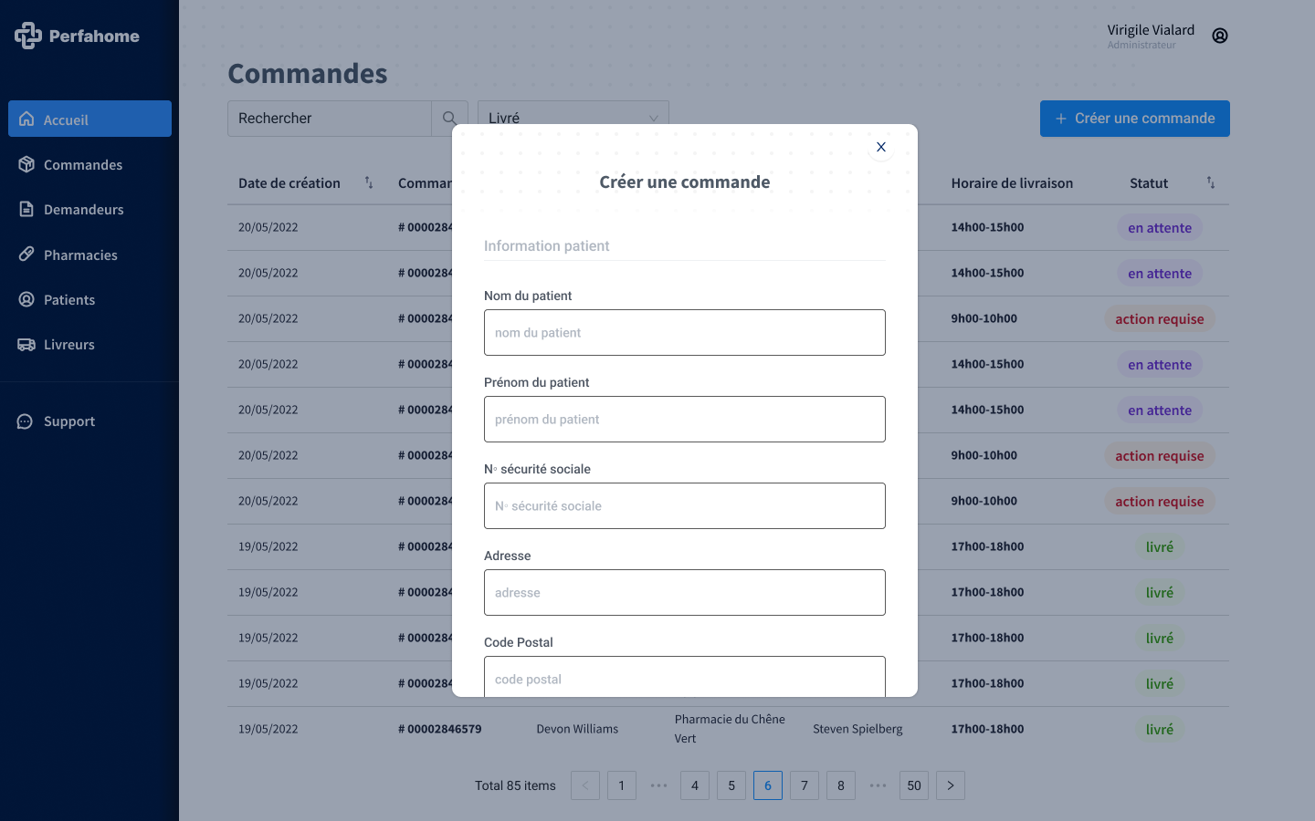
Perfahome helps pharmacies plan patient visits, prepare medical equipment, and follow deliveries in real time: on desktop for operations, on mobile for the field.
How do you align three very different users on the same platform?
Operations needs density and speed. Field teams need clarity under pressure. Patients need reassurance. The interface had to serve all three without diluting any of them.
A shared design language that flexes between dense dashboards and focused mobile flows.
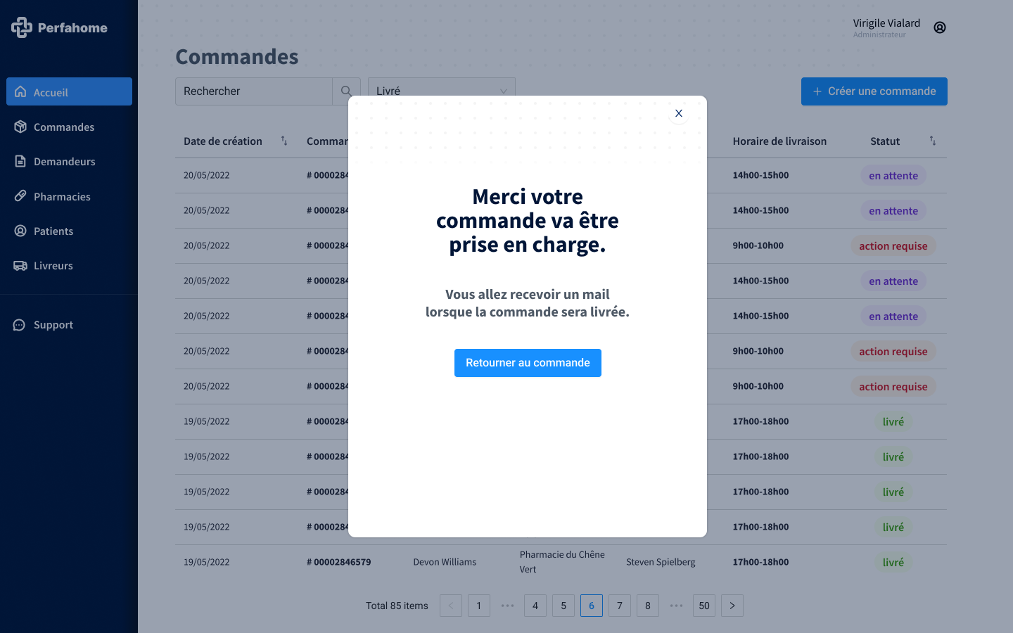
I built a modular component library tuned for information density on desktop and one-handed use on mobile, with a teal brand anchor and a secondary blue for actionable states.
Patient details, delivery status, and equipment lists share the same visual grammar across surfaces, so switching from desk to field feels continuous.
Teal as the trust anchor, blue for action, ink for density.
- Teal#1DA1A4
- Deep teal#0C949C
- Accent blue#2894FC
- Ink#041433
- Soft grey#B7BEC5
One design system powering three very different surfaces.
The same component library ships the operations dashboard, the delivery app, and the patient interface, cutting front-end scope by roughly a third compared to building three separate products. Operations teams reported a faster onboarding time, and field staff could switch between desk and mobile without relearning the interface.