Mint is the first free French quarterly magazine dedicated to the pleasures of the table and travel.
The goal of the design overhaul was to implement the new frequency of content and new categories, and by doing so increase site traffic.
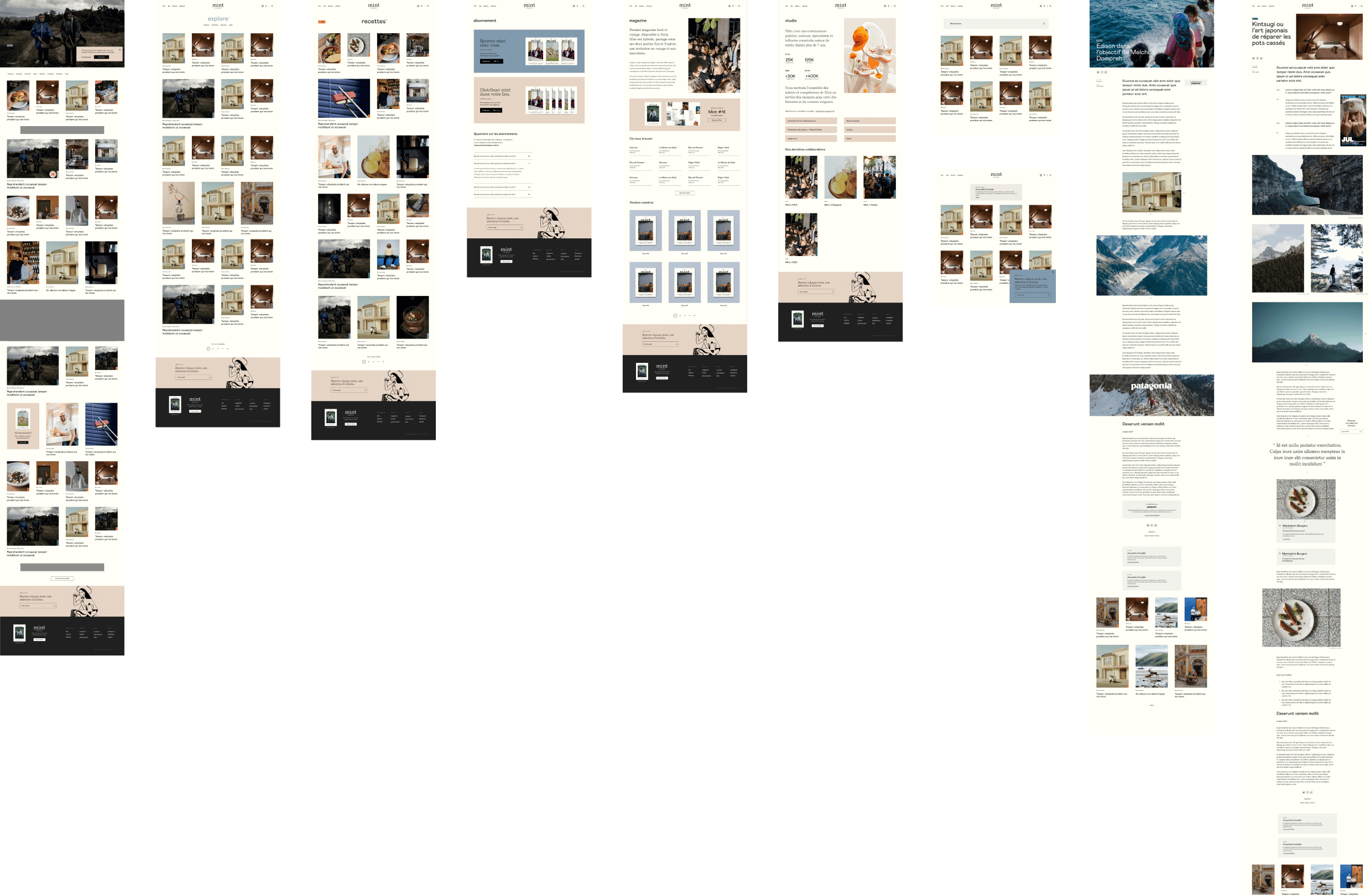
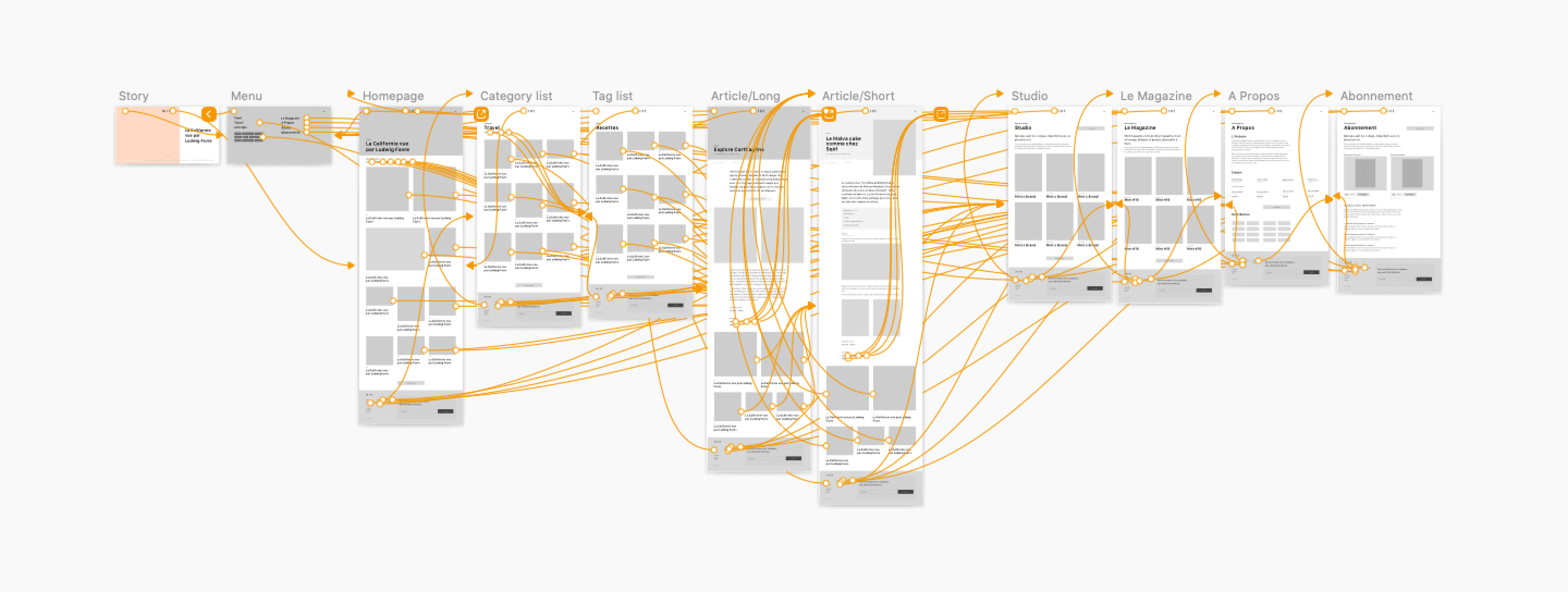
Mobile-first mockups and the wireframe prototype that led the design direction.
- Increase readership by improving site design and navigation
- Improve the time spent on the site
- Integrate new content types
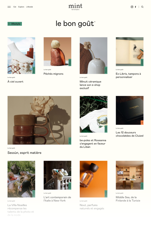
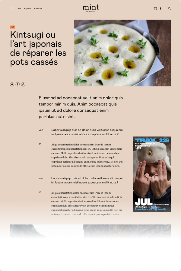
Bigger typography, larger imagery, and a refreshed category system.
After a design study we encountered a few issues, particularly site legibility and reading comfort. The avenues for improvement were to use larger type faces to make text more readable and to widen the layout.
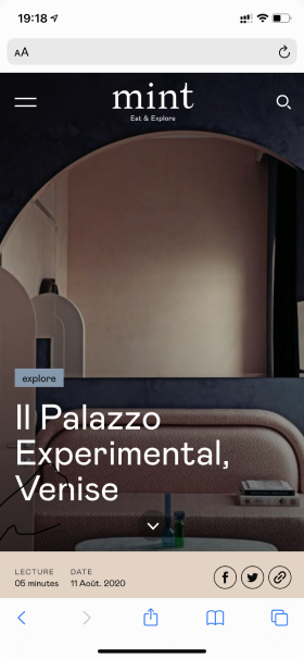
Another lever was to improve the mobile version, which was not well adapted.
To respond to the increase in content types (and after using the card-sorting method), we established a new category system and added tag-based classification.
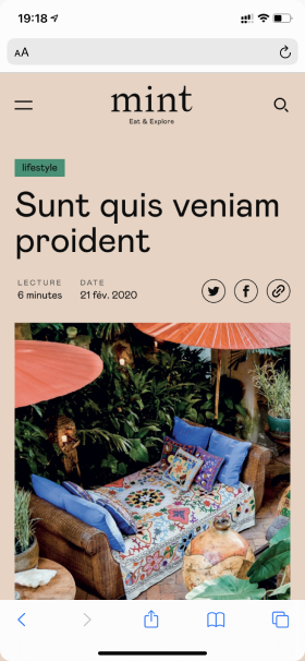
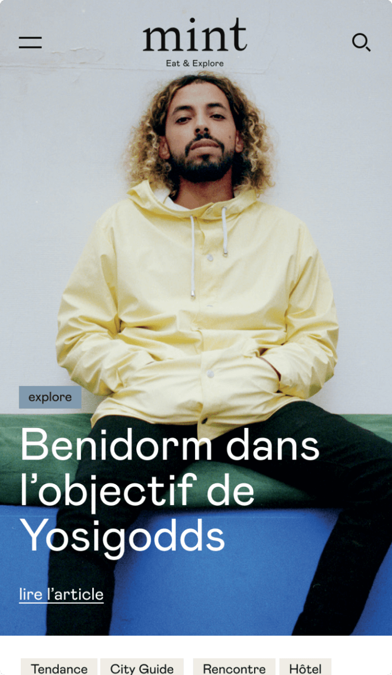
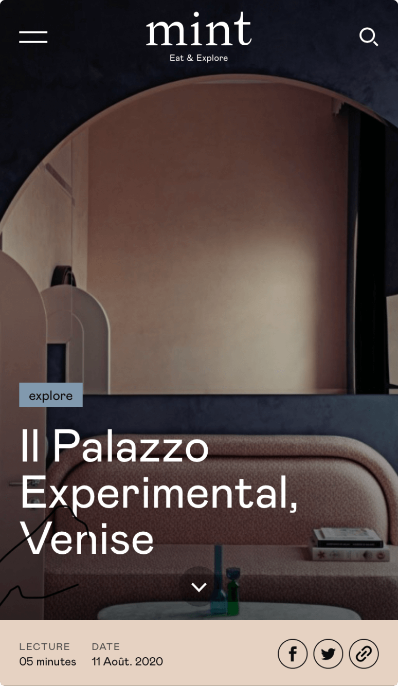
Mint is a medium where the magic comes from beautiful photography, so one of the first moves was to introduce large images capable of inspiring and engaging the audience, simulating a print magazine cover.
The first prototype allowed us, after a hallway test, to add infinite scroll at the end of articles, increasing time on site by promoting immediate access to a second article.
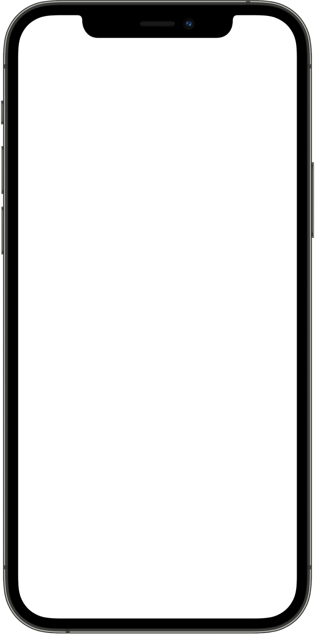
Homepage (mobile)
Category view
Article view
A restrained editorial palette that lets photography lead.
- Ink#192E3D
- Warm#A1884C
- Photo Blue#376CB1
- Accent#EE8B32
- Soft Grey#ABB0B5
+72% users, lower bounce rate, deeper sessions.
Users increased by 72%, supported by a social-media marketing campaign. Over the same period, the bounce rate dropped from 75.84% to 67.74%, and pages per session rose from 1.91 to 2.32.