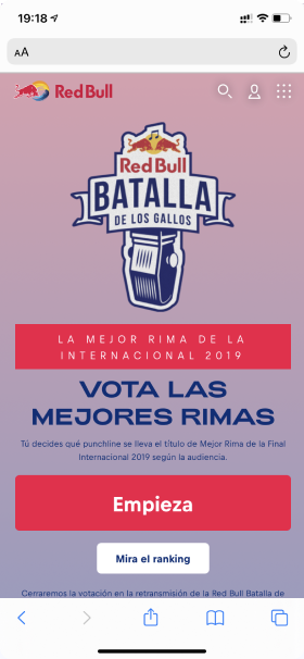
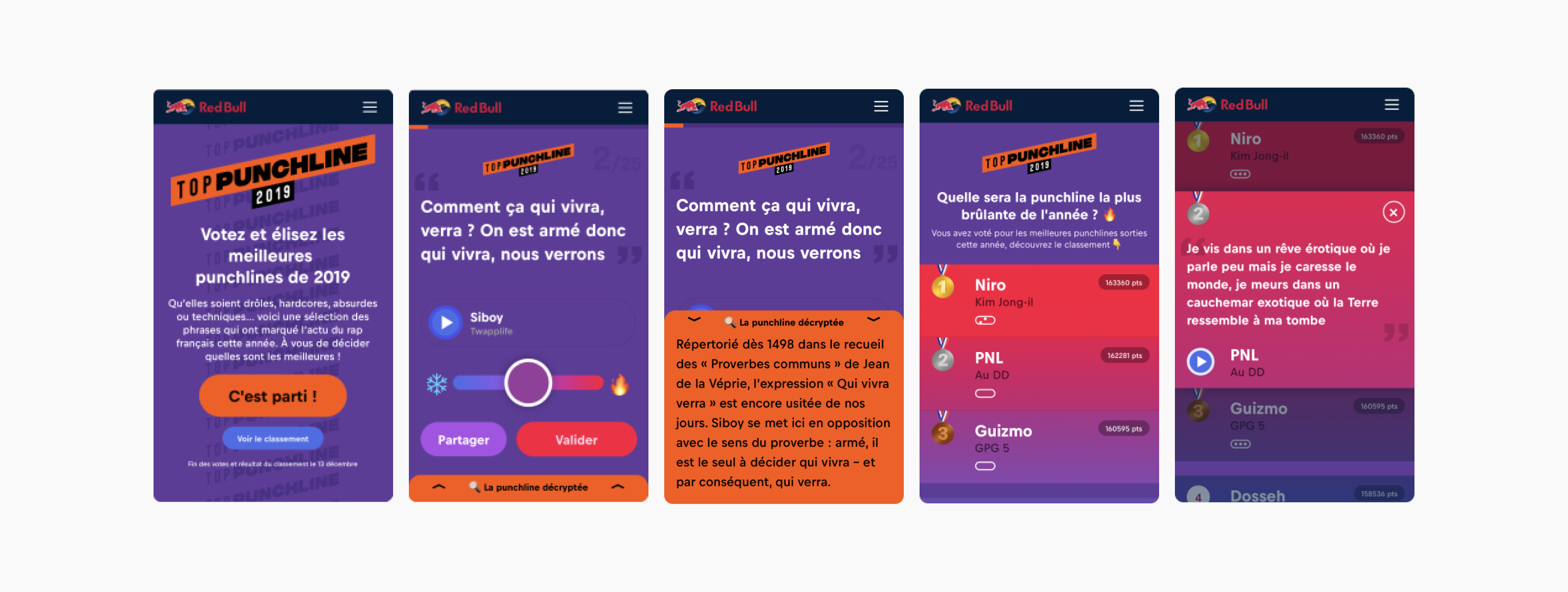
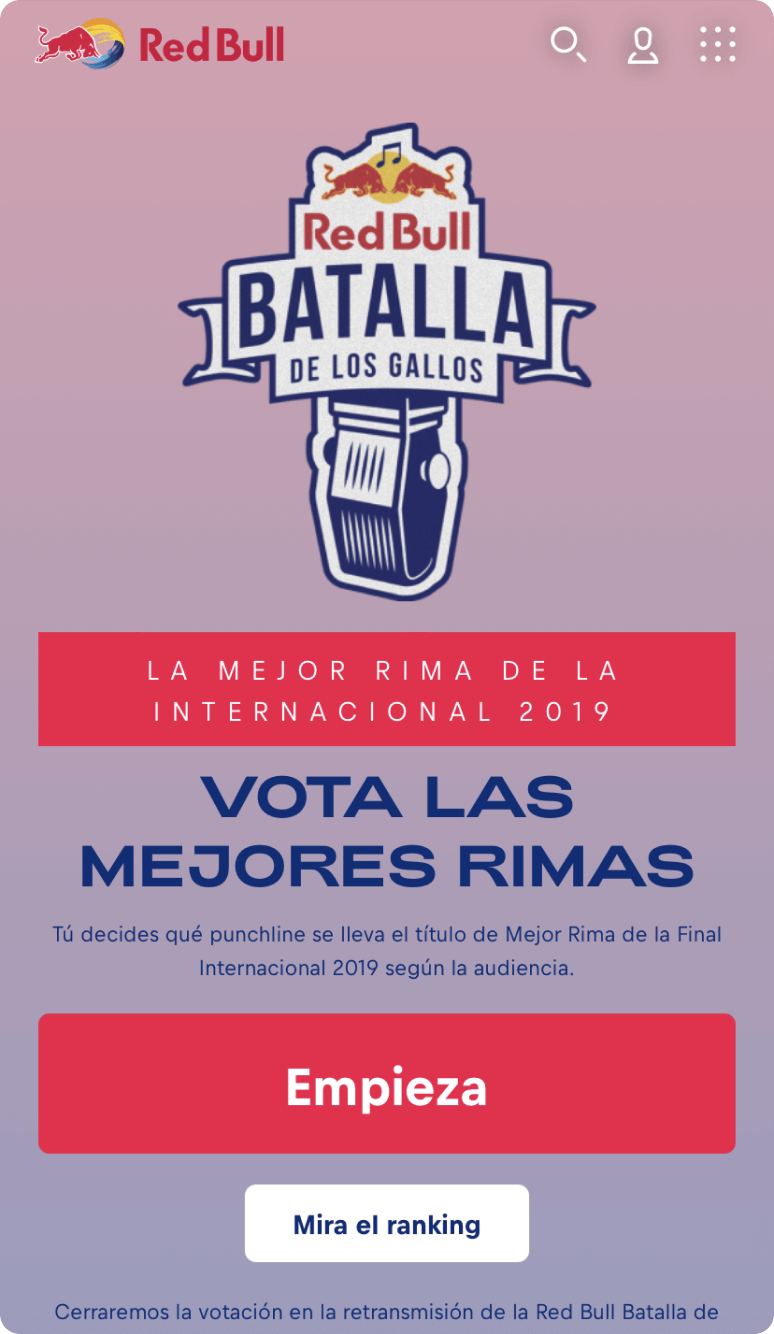
The Red Bull team wanted to build an engaging experience to elect the best rap punchline of the year.
The idea was to maximise participation and elect the best punchlines among those selected by Red Bull.
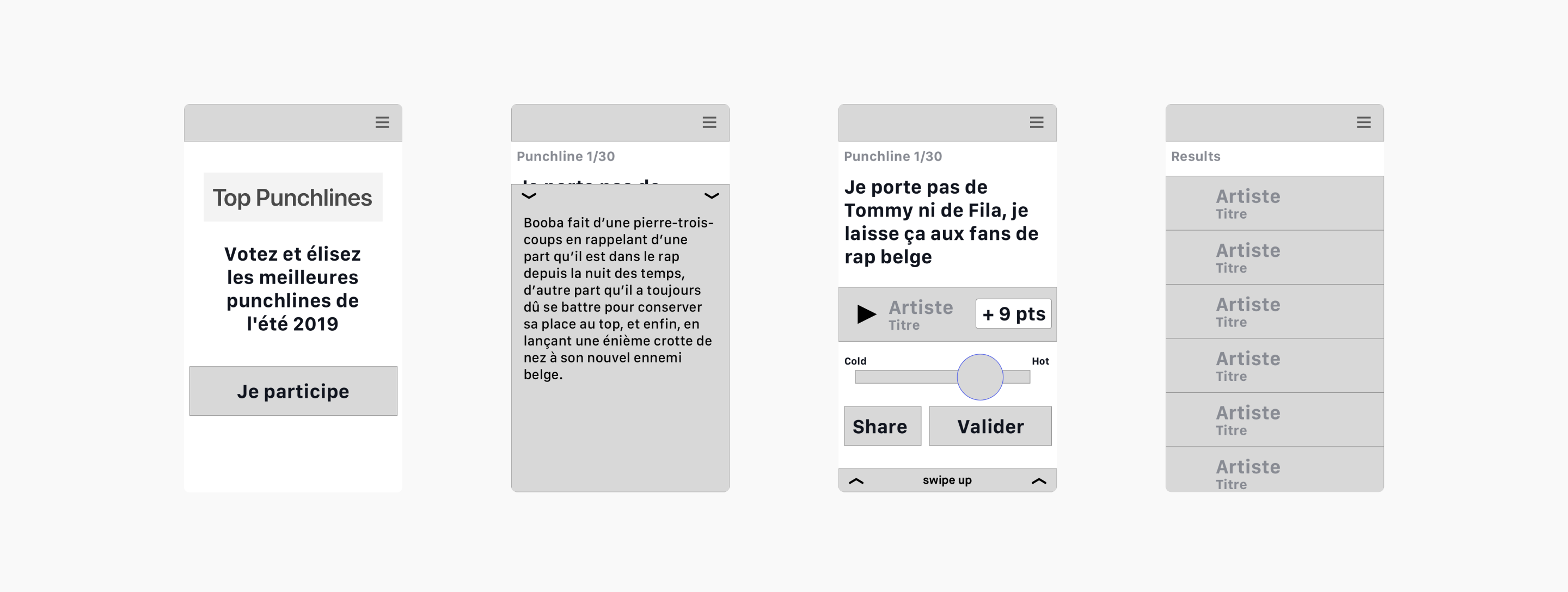
From wireframe to final UI, here are the key design artefacts that shaped the experience.
- Purple#623C9C
- Blue#4A6CE9
- Orange#FF5500
- Red#FE013C
- Black#010206
- Light Purple#AA50E8
- Accent Blue#0678FE
- Gradient#0678FE → #FE013C
How do you keep users engaged through a long questionnaire and drive the most votes?
Lean on familiar social-media patterns to make voting feel effortless.
After defining the end users, we found that the majority were from Generation Z and 65% used their smartphone to browse the Red Bull site. They are rap lovers and already familiar with the Red Bull brand.
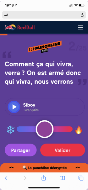
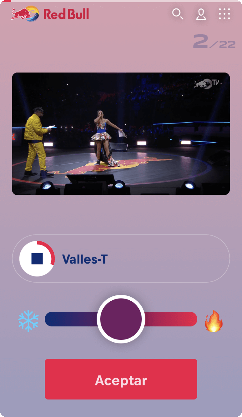
From there, the goal was to make the experience simple and enjoyable. The solution was to use an emoji-embellished slider to let users vote.
The slider borrows an existing pattern from one of the main social networks (Instagram) and layers on a rating from 1 to 5.
To encourage users to finish the questionnaire, we added a progress bar and micro-animations to increase the overall appeal.
Swipe gestures were also considered, since the marketing campaign was mobile-first.
220k+ participants in one month.
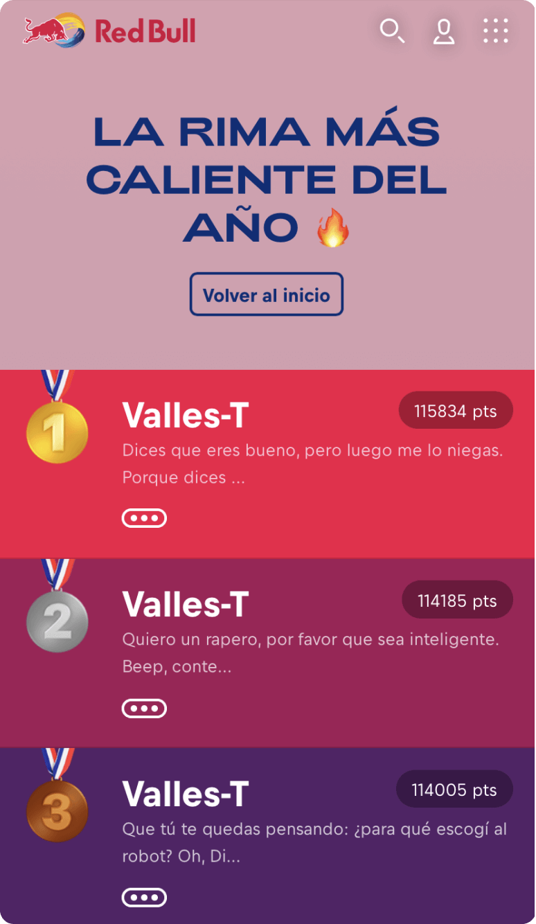
For the French edition, the campaign was a success with more than 220k participants in one month of activation. Using existing UI patterns can, and should, be a solution when users already understand them.